Ethan Devlog
What you prototyped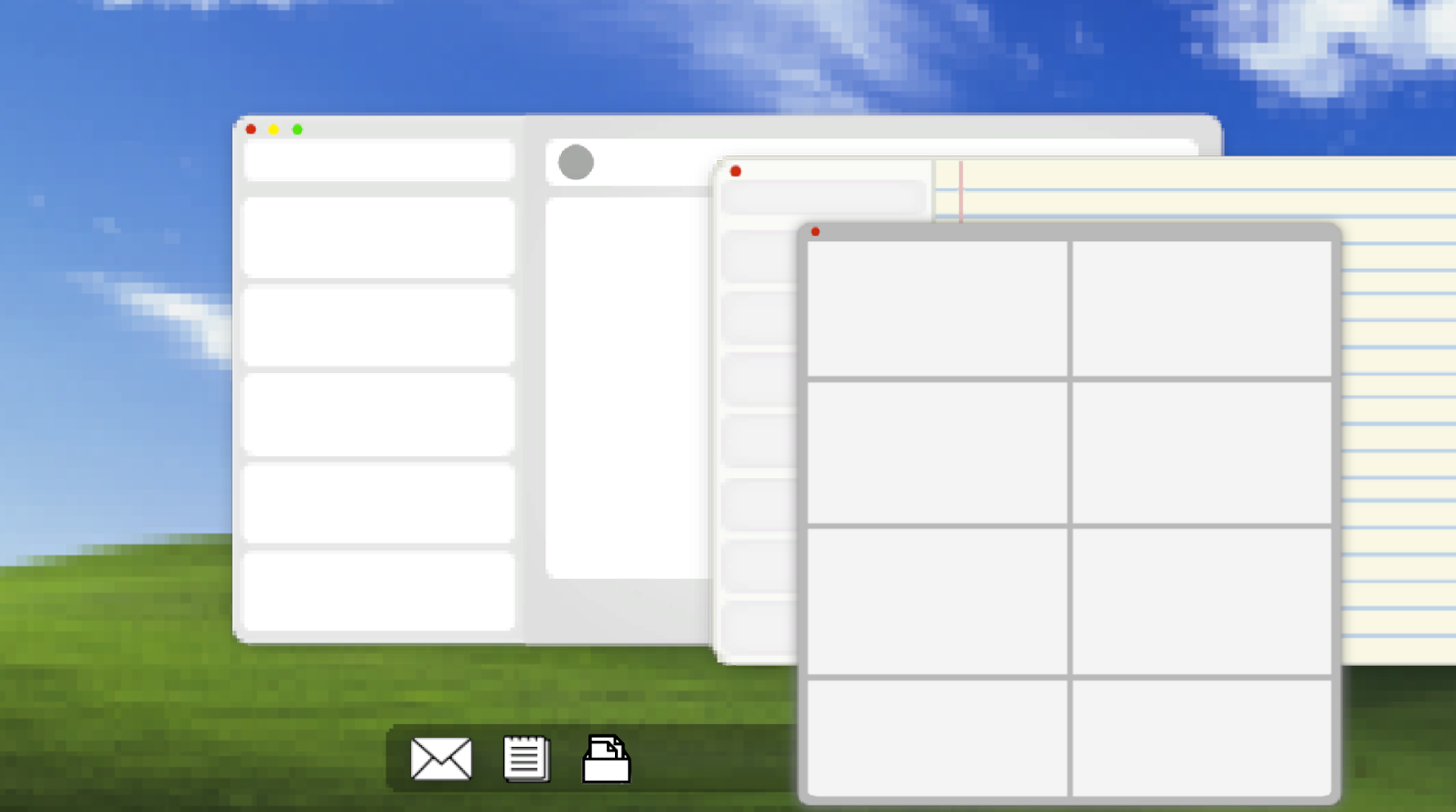

Prototyped recognition of UI solely based on visual design, no text at all
Concept:
- Design desktop style aesthetic UI
- Four apps:
- Notes
- Text/Messenger App (will not be included in final prototype)
- Archive

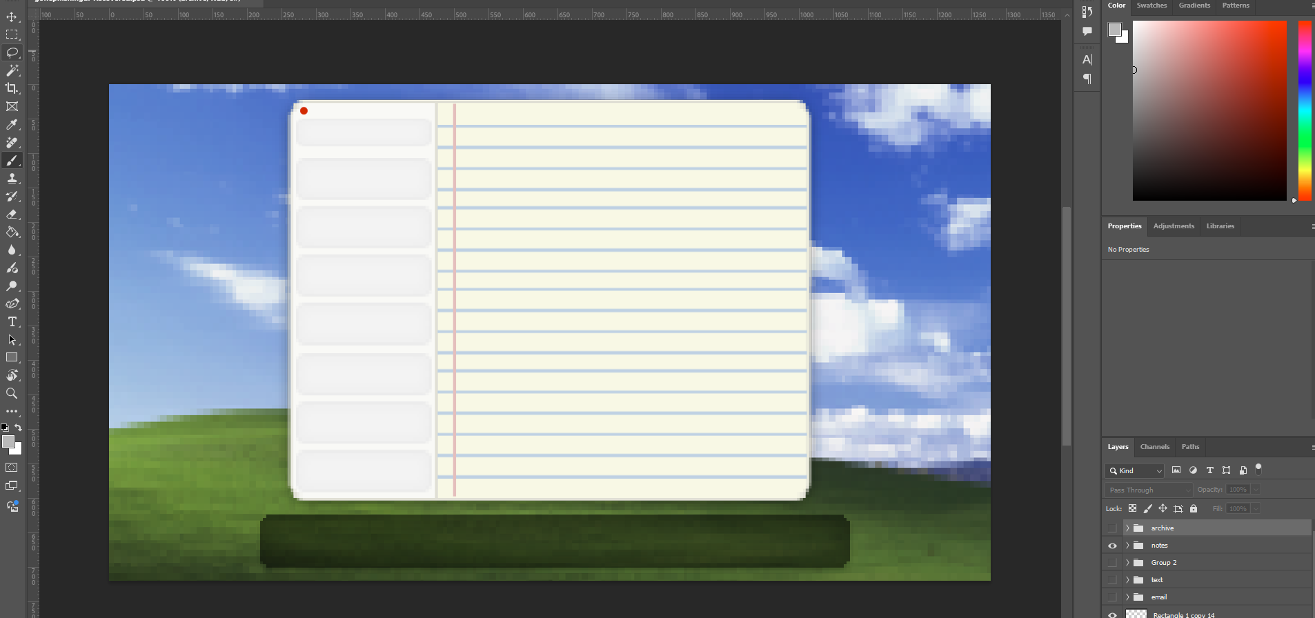
- For the email, I wanted to design the layout and iconography to fit with the common layout design of an email app. This would include the profile picture placeholder, contact information box, and email box with email description/information
- For the notes, I purposefully added colors that resemble some sort of notes application, with lines and colors. Also includes buttons on the sides to switch to different note files.
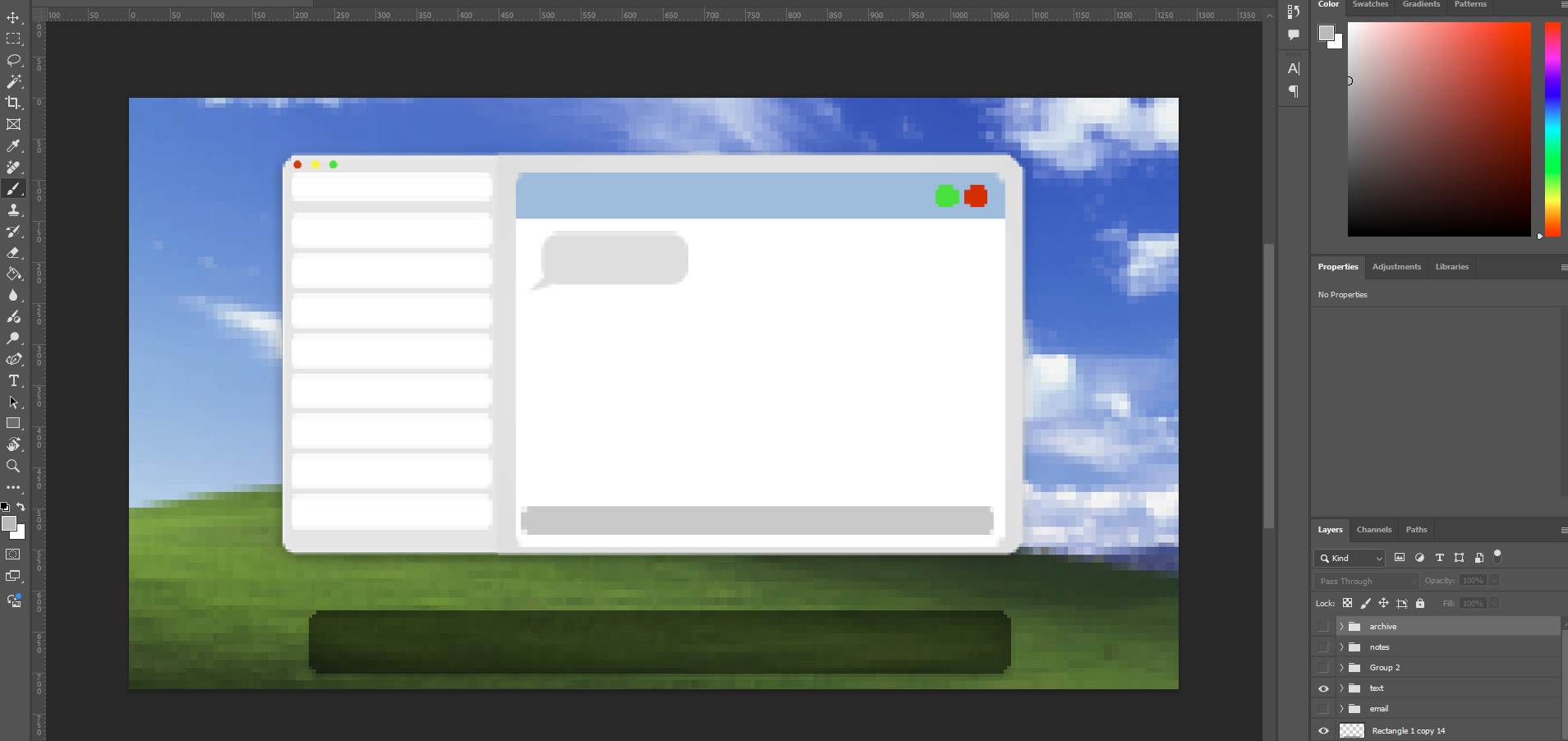
- For the texts, I created a similar structure to the emails, but added different visuals, including the text bubble which the player will first see, indicating that they have received a message.
How you developed and evaluated it
Process:
- For the emails, I wanted to focus on the layout of the app. I wanted players to understand what each section of the emails meant, and how they were interactable. How would players guide themselves through looking for specific features of the email app, and how would they find buttons to use when playing the game?
- This is the core user experience building of the game, creating the structure of how the player will navigate through apps and seeing if they can figure out certain functions without having explicit text to tell them what it means exactly.
- The texting app (which is not included in the final prototype yet), I wanted to have a similar structure to the emails, where the player is still able to navigate through buttons and areas of the app similar to the emails, so players don’t feel too different from the functionality of the emails compared to the text.
- The notes had a fairly clear end development to it, I mainly focused on the colors of the note pages, the section on the right side where the player will see information about the features of phishing scams. Although, the aesthetic and color didn’t really matter in the end exactly, as most of the visuals will rely on the information displayed on the notes.
- I wanted the notes app to have a very simple structure, where players will only need to select buttons on the side to go through different note pages.
What you learned along the way
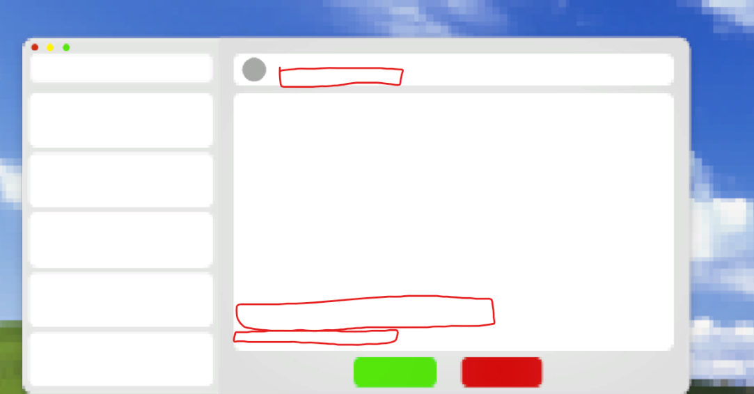
- During the playtest, I noticed that most of the player confusion stemmed from the email app. Some players did not understand what it might have been, or what the main text boxes on the right section of the app may be. Until I have shown them the text app, then they would understand how the email structure would work.
- What I may need to work on fixing is the main big box in the email section, where there may need to be some sort of separation to help players identify what portions of the email are meant for. For example:
- A section for attachments
- To and from sections in the top box (header with profile picture)
- Links?
How this informs your project
- In terms of our team's scope, this does not affect our consensus at the moment, but it does open us to some new opportunities which will allow us to improve in our games overall playability and experience.
- It is unknown at the moment if adding any additional UI features like the texting features will expand our scope too far, and we may have to constrain a bit and remove some of those features.
- Overall, most of the playtest has gone well and expected so far, and will just need a little bit of fixing and playtesting once the functionality of the buttons begin working for future playtests.
Leave a comment
Log in with itch.io to leave a comment.